For comparison, a classic S&L recently posted by WAF member Veles on the '57 forum (hope OK with him if re-posted here)--more central location of F and spacing above M highlighted:
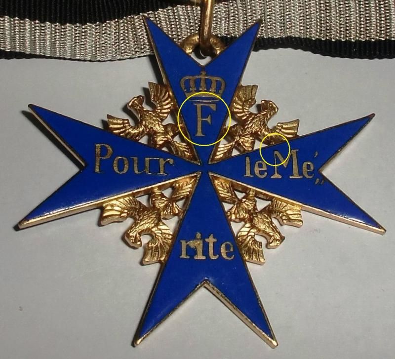
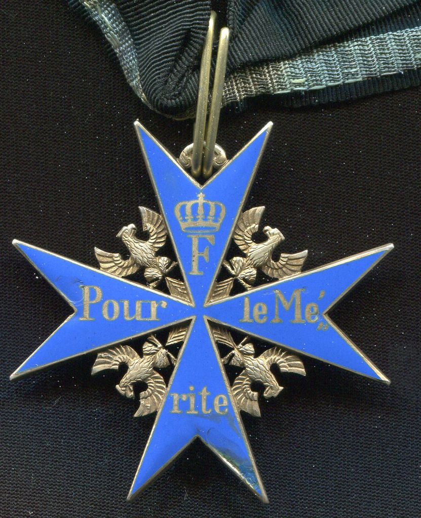
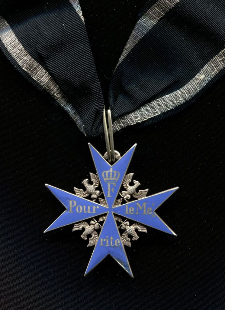
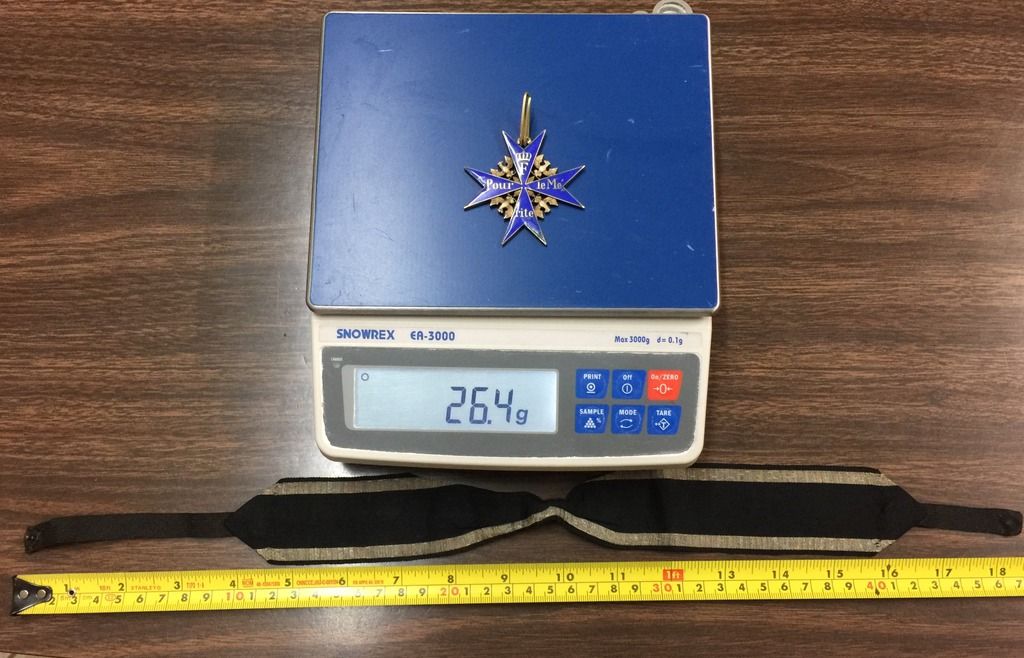
vs Silver FR from MedalNet, entire F shifted more to the left of center and the top of the M closer to the cross edge:
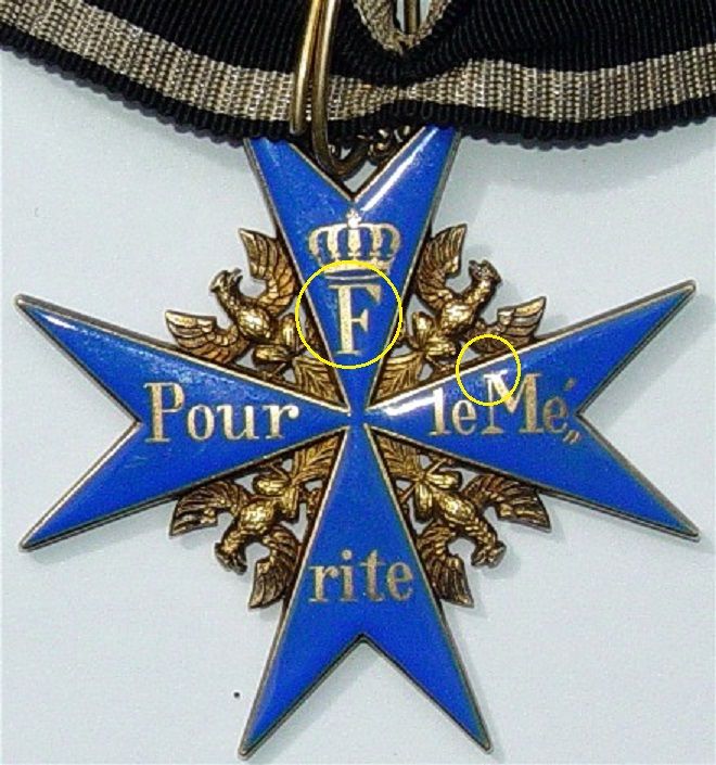
(Note that in the S&L example, the cross is actually tilted a bit, which if anything would make the M appear closer to the edge than it actually is. Were the FR tilted to the same degree, it would very nicely match the cross in the display.)

vs Silver FR from MedalNet, entire F shifted more to the left of center and the top of the M closer to the cross edge:

(Note that in the S&L example, the cross is actually tilted a bit, which if anything would make the M appear closer to the edge than it actually is. Were the FR tilted to the same degree, it would very nicely match the cross in the display.)

Comment