Announcement
Collapse
No announcement yet.
BSW PILOT #2 for Review
Collapse
X
-
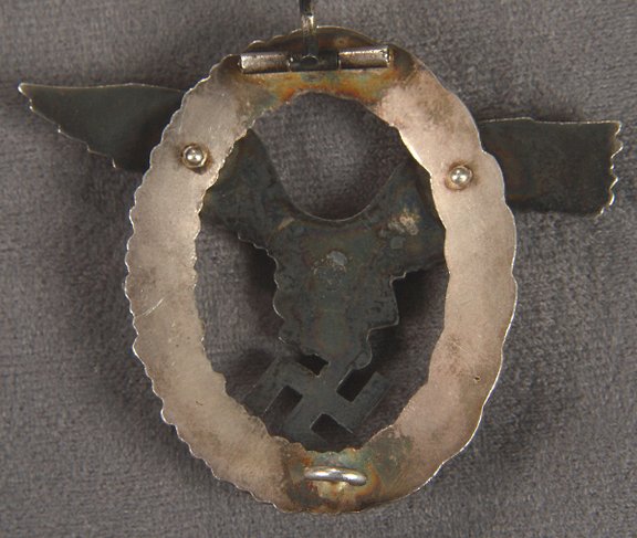
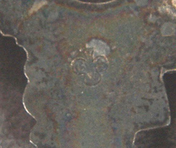
Hi Mark. It looks like a good BSW second-type with the "shamrock" logo. These usually have a thin metal flashing connecting the swaz to the eagle's talon that seems to be missing. Can you tell if it had been removed?Visit my Badge Collection: http://lbmilitaria.homestead.com/home.html
-
Hi Lorenzo,
Thanks for the 'rapid response' on both Badges! Sorry, but the badges are not in my possession. I'm afraid we can only work with the images at hand.
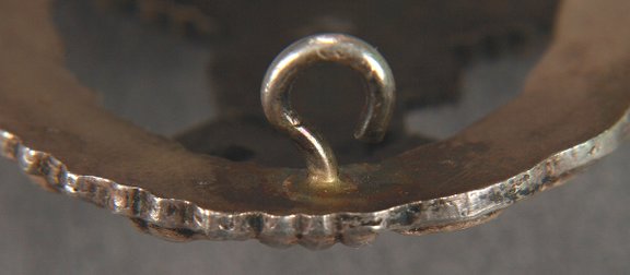
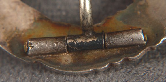
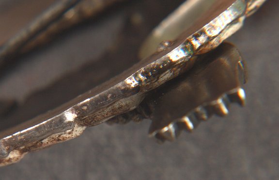
Isn't the catch on this badge a bit 'fat'? And I was under the impression that it should be taller? And a more subtle '?' .
Regards,
Mark"You can check out any time you like ..... But you can never leave....."
Comment
-
The catch does not look too "fat" to me. I think the height and shape of the catch is fine...it need not be a perfect "?". The catches often get bent out of shape anyways.Originally posted by mmiller View PostHi Lorenzo,
Isn't the catch on this badge a bit 'fat'? And I was under the impression that it should be taller? And a more subtle '?' .
Regards,
Mark
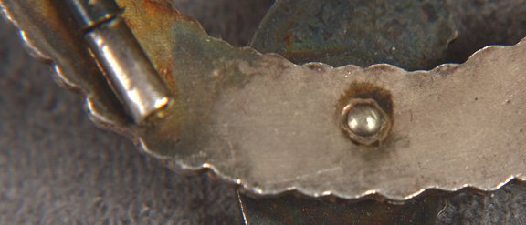
However, on second look, I might question the rivets as they seem different from others that I've seen.Visit my Badge Collection: http://lbmilitaria.homestead.com/home.html
Comment
-
Mark,
I may be wrong, but personally I am not keen on this one either. It's definately closer than the other one you shown (#1), but still it's not textbook BSW IMO either.
- The catch looks like they are trying to get the "?" shape right, but IMO the stock material is too narrow and should be fatter in thickness, not skinnier and the attempt is too dramatic and not subtle as previously mentioned above.
- I do not like the discoloration on the back at all and is IMO, reminiscent of over heating and telltale of recent manufacture.
Again, no expert here, but I would not want either of them in my collection and my collection pales in comparison to yours.
TimLast edited by Tim Ball; 10-21-2006, 05:53 PM.
Comment
-
Mark,
I don't know, the more I look at it, the finish on the wreath makes me wonder if it's just the PIC making it look like a bad finish and the badge actually has nice frosting; silver is sometimes hard to capture the true look...

Here's a couple of mine to compare rivets and finish. The catch still concerns me on yours though.
TimLast edited by Tim Ball; 03-25-2007, 07:33 PM.
Comment
-
Hi Tim,
No 'paling' involved, but thank you just the same. These badges are not in my collection. I am neutral here, just as all else commenting. The other badge, BSW #1 is a thumbs down for me. I am, as are you, also sceptical on this one, BSW #2.
I believe that the rivets in the Advisor are both flat on the top of the dome, to greater or lessor degrees. #2's rivets are not. Should ALL BSWs have flat tops, I thought so, but maybe I am wrong. And like you, the catch has me wondering. And even in BSW #2, is the 'W' in the cloverleaf too high? Compared with the mag article, I think so. The top of #2's 'W' is at a horizontal axis with the top of the bottom cloverleaf. The article appears to show the 'W' lower in the leaf.
Maybe we are getting too anal. Bottom line for me ... it might be OK, but it's one of those badges I would always wonder about.
Mark
And by the way, a gorgeous 'Full Name' (textbook) Pilot you display there!Last edited by mmiller; 10-21-2006, 07:29 PM."You can check out any time you like ..... But you can never leave....."
Comment
-
Tim,
The lighting may have caused the discoloration, or maybe miscoloration is a more appropriate word. I am not questioning the finish. Ok, I dragged all the camera gear out, and here is what I can offer to 'the mix'.
Rivets- Domed with a flat top.
Catch- Taller without a pronounced '?'.
Makermark- As it should be: 'W' resting low in the cloverleaf.
Again, it may be OK. But too many 'what abouts' for me to sleep well at night. The Plot Thickens..........
Mark
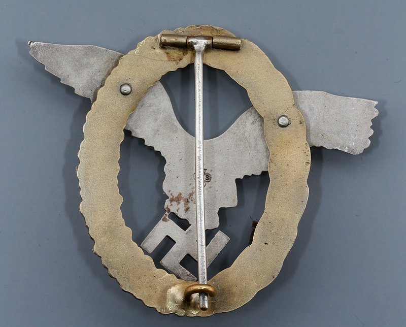
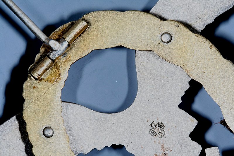
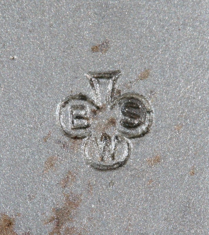
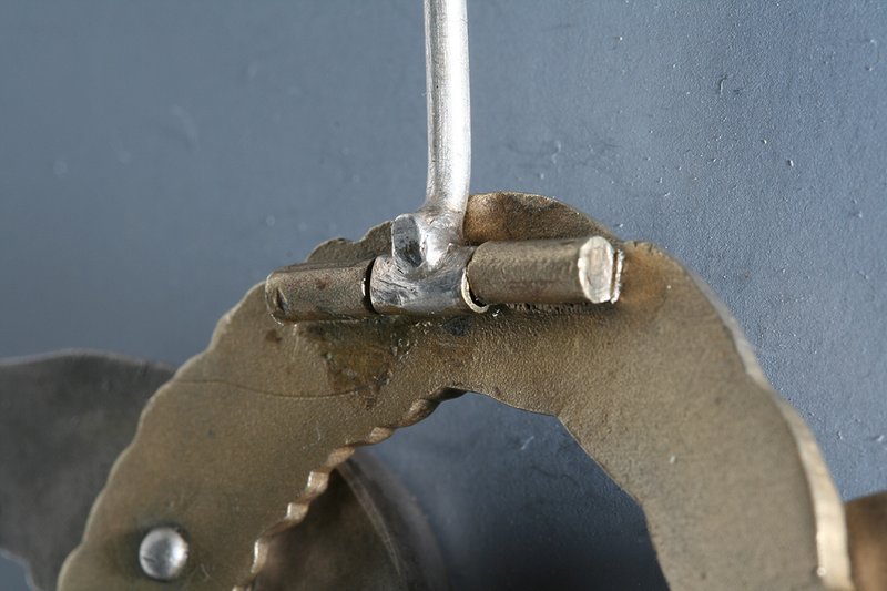
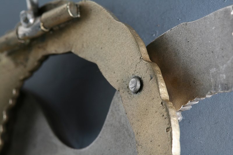
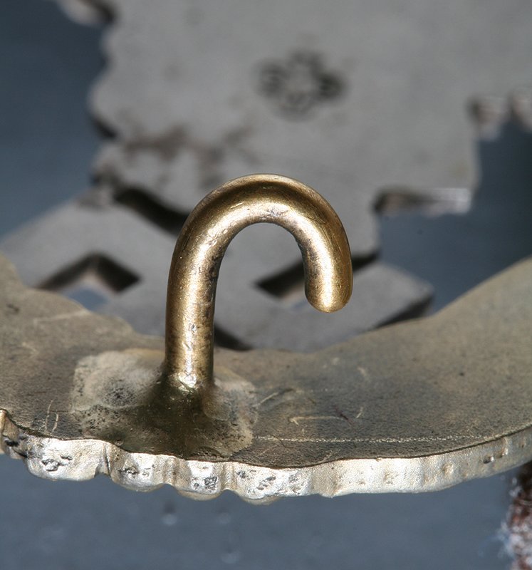 "You can check out any time you like ..... But you can never leave....."
Comment
Users Viewing this Thread
Collapse
There is currently 1 user online. 0 members and 1 guests.
Most users ever online was 10,032 at 08:13 PM on 09-28-2024.

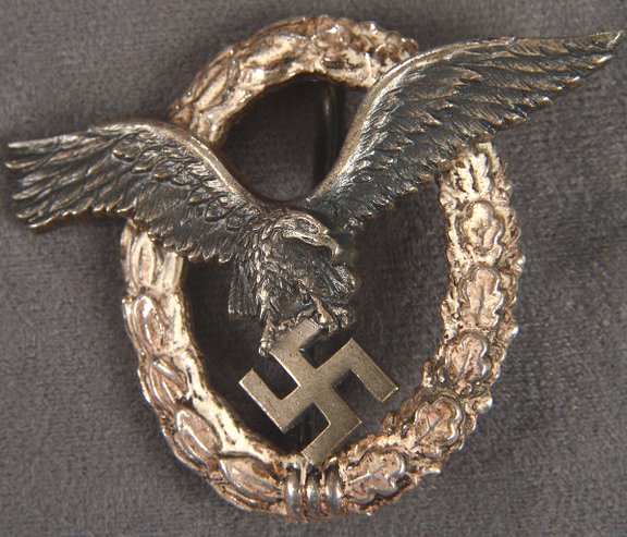
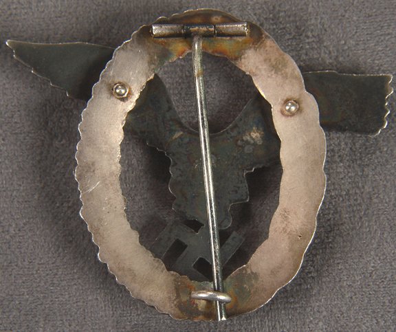
 I never cared for the #1 you showed but the #2 looks ok, IMO.
 Everything there I would look for.
Comment